How do you recognize a brand?
…By its logo?
Logos are the best way to establish your brand’s identity. It makes people remember your brand and ensure repeat visits on your site. It even helps in creating a fan base. At OutBoost Media, we always keep up with the trends when it comes to logo designing. Check out the 10 best logo design trends that I’ve compiled for you guys and let me know which style you like the most.
1) Dotted logo
Isn’t it’s amazing to see when people create something iconic with something so simple? Take a look at the idea behind this logo. Whenever you think of a particle, round shapes come to mind, right? So, they made the logo with small black spheres. There is one blue sphere in there as well as blue represents reliability and peace.
- Pros of Dotted logos: These types of logos are easy to create. They are perfect for startup companies that are looking to make a mark.
- Cons of Dotted Logos: These logos are pretty eye-catching but usually require great designing to ensure quality. Logos like these must convey a message to the consumer about the company.
2) Circles
Designers love to create logos out of spheres and circles. The idea behind logos like this is quite straightforward. The simple the design, the better it is received by the audience. More and more companies are now embracing this style of simplicity.
- Pros of Circle logos – As spheres and circles represent a positive and emotional message. Using a circle in a logo represents friendship, community, love, relationships and unity. You can use these types of logos for websites that are associated with building relationships with people.
- Cons of Circle logos – Using these logos for organizations dealing with pharmaceutical, education, IT, telecom, etc. is a big NO…
3) Wordmarks
Wordmarks logo trend is timeless. With digital-first design trending in 2016, this style is surely getting noticed. It is less distracting than more illustrative styles and easily blends into websites and apps.
- Pros of wordmarks logo: One of the major benefits of a wordmark logo is its simplicity and ease of understanding it. With a wordmark logo, the name of the company or product is obvious, as it is the only component of the logo. This memorable identity will stick in the consumer’s mind, thus creating greater brand recognition.
- Cons of wordmarks logo: The text-only nature of a wordmark logo doesn’t mean that the logo will always be interesting. You really need to choose attention-grabbing colors and fonts, to ensure that the logos are eye-catching.
4) Handmade Logos
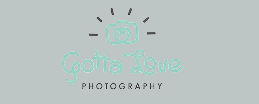
Okay, this kind of style may look a bit informal, but they are catching on quick. People usually find handmade logos like these comforting and personal. They started out in blogs and now slowly taken up by creative agencies/companies. The best thing about handmade logos is that they are not restricted by the typography of the digital world. They can be bespoke and as creative as a brand wants it to be.
- Pros of Handmade logos – These logos don’t need the serious sophistication like various minimalist styles. These logos allow designers to add more color to their logos, creating freer tones in designs.
- Cons of Handmade logos – Handmade logos don’t offer professional looks. Most of the companies offering IT, consultation, and education, etc. avoid using these logos.
5) Linked
Logos that exemplify linkage are mostly found on companies that believe in partnerships and building relationships. It shows unity, conformity and commitment. Usually, companies that are merging to form a new brand or companies with different technologies under one roof, tend to go for logos like these.
- Pros of Linked logos – These logos are great examples for businesses that involve networking of people. The idea of linkage can be perceived in many ways, but in general it is about pairing one with other for expansion and growth. These logos invoke trust in people.
- Cons of Linked logos – These kinds of logos have to be used carefully and should justify the nature of the company using it. They can look repetitive and boring to some people.
6) Modern Retro/Vintage
This logo trend kind of picked up in 2015 and it continues in 2016 as well. This kind of logo is a blend of the flat styles of today with the styles and shapes of older logos, giving this style a retro yet fresh look. You can say it’s a refreshing take on the vintage logo style. The best part about these types of logos is they instantly capture the attention of a user. And of course, they are quite easy to remember and identify among other logos.
- Pros of Vintage Logos: Vintage logos offer a sense of history, stability, and reliability. Even if your business or organization is new, using a vintage design logo can give people the feeling that it has been around for a while, and it’s a company they can trust.
- Cons of Vintage Logos: They are not as sleek as the minimalist styles are, and they usually don’t get much attention from millennials. It may not work for some new companies that are trying to look old but don’t hold the values of an older company!
7) Dynamic
You have seen this logo style way too many times by now. Haven’t you? Well, this kind of logo style is known as dynamic logo style, where the basic structure stays the same but some changes are made to the logo to make it appear a bit different. The idea behind this kind of logo is to make people identify the main brand while introducing new sub-brands to them.
For example: USA TODAY – The company keeps adding new colors along with their primary brand name to introduce new or a different branch of its network. People remember the main USA TODAY logo, so they can easily identify with the new changes.
- Pros of Dynamic Logos– These types of logos are mostly used by organizations like news channels, lifestyle magazines etc.
- Cons of Dynamic logos – For logos like this to work, the main logo has to create an impact first. If the customer remembers the main company, only then they are going to recognize and relate with dynamic logos of that company. It may also be confusing for the users to connect a color to a particular branch of company.
8) Letterstacking
This is a tricky one, but it is getting quite popular in 2016. Basically, a logo like this challenges a consumer to make sense out of the logo. It instantly grabs consumer attention and draws them in. By the time the consumers decipher the logo, they are hooked.
- Pros of Letterstacking logo – These type of logos are very popular among youths. These are quite tricky and eye catching. They usually get well received among the youths.
- Cons of Letterstacking logos – Sometime these types of logos fail to offer their real meaning. They can be eye-catching but may lose out on conveying the real meaning of the logo. It can be confusing for an older audience.
9) Negative Space
This kind of logo design is what we call the epitome of creativity! The more you look at these kinds of logos, the more you understand the meaning behind it. Usually, businesses that want to convey a deeper meaning, or show their creativity, choose these kinds of logo styles. The ability to communicate more without adding anything extra in the logo is a challenge for a designer, but when it comes of, it is beautiful to watch.
- Pros of Negative Space Logos – Most of the companies use these type of logos to add multiple meaning to their logo. These logos are great to attract customers and make them think twice.
- Cons of Negative Space Logos – Sometimes these types of logos are so complicated that sometimes people cannot figure out the meaning behind the logo. They usually don’t work with people who have short attention spans.
10) Half and Half
This is quite an old way of creating logos. The logo is split in half. They try to give an extra dimension to the logo by creating an illusion between the top and the bottom half of the logo. This style has gained popularity in the last 7-8 years and is quite eye-catching.
- Pros of Half and Half Logos – These logos are attention-grabbing and offer a two dimensional color effect to your logos. It makes the logo unique.
- Cons of Half and Half Logos – These logos are time consuming and sometimes the meaning is lost on the consumers. The image on top has to reflect and connect to the name of the company below or else it won’t make sense to the consumers.
Sources:
https://www.spellbrand.com/top-10-dotted-logos
https://www.logolounge.com/articles/2016-logo-trends
https://99designs.com/blog/trends/top-logo-design-trends-2016/
http://justcreative.com/2016/01/02/2016-logo-design-trends-forecast/
https://www.logolounge.com/articles/2016-logo-trends
https://www.elegantthemes.com/blog/resources/10-logo-design-trends-to-look-out-for-in-2016
https://www.elegantthemes.com/blog/resources/10-logo-design-trends-to-look-out-for-in-2016
http://justcreative.com/2016/01/02/2016-logo-design-trends-forecast/
http://justcreative.com/2016/01/02/2016-logo-design-trends-forecast/
https://www.logolounge.com/articles/2016-logo-trends
https://www.logolounge.com/articles/2016-logo-trends


